Tile
The following page documents visual specifications such as color, typography, and structure.
Color
| Element | Property | Color token |
|---|---|---|
| Tile:background | background-color |
|
| Tile border | border |
|
| Icon | svg |
|
| Checkbox icon | svg |
|
| Checkmark icon | svg |
|
| Chevron icon | svg |
|
- Denotes a contextual color token that will change values based on the layer it is placed on.
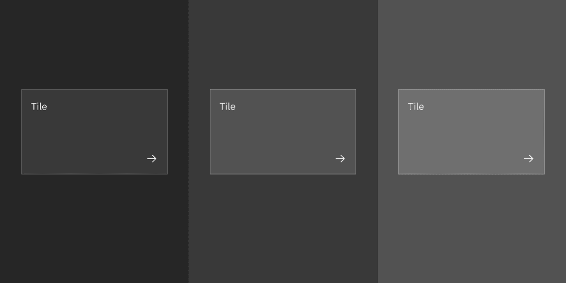
The example shows layering tokens applied across layers in the Gray 100 theme.
Interactive states
| Element | Property | Color token |
|---|---|---|
| Tile:hover | background-color |
|
| Tile:focus | border |
|
| Tile:selected | border |
|
| Tile:disabled | border |
|
| Icon:disabled (or pictogram) | svg |
|
| Text:disabled | text color |
|
- Denotes a contextual color token that will change values based on the layer it is placed on.
Base tile
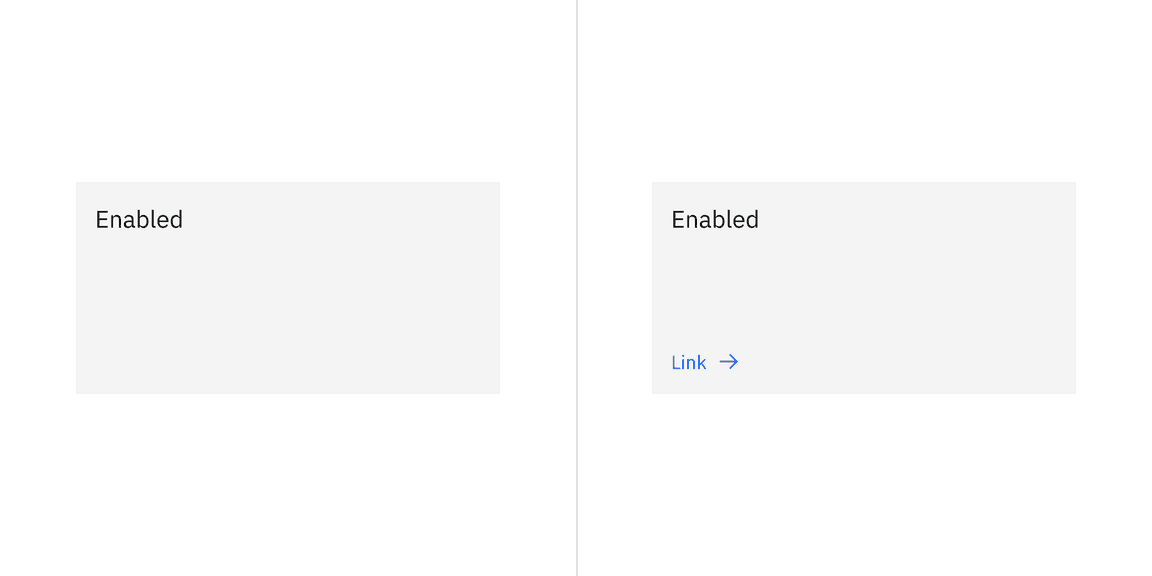
Base tile doesn’t have a border. It’s not interactive, but can have interactive elements. Base tile only has the enabled state.
Clickable tile
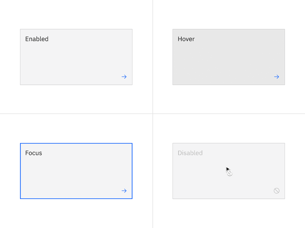
Clickable tile has four states: enabled, hover, focus, and disabled.
Selectable tiles
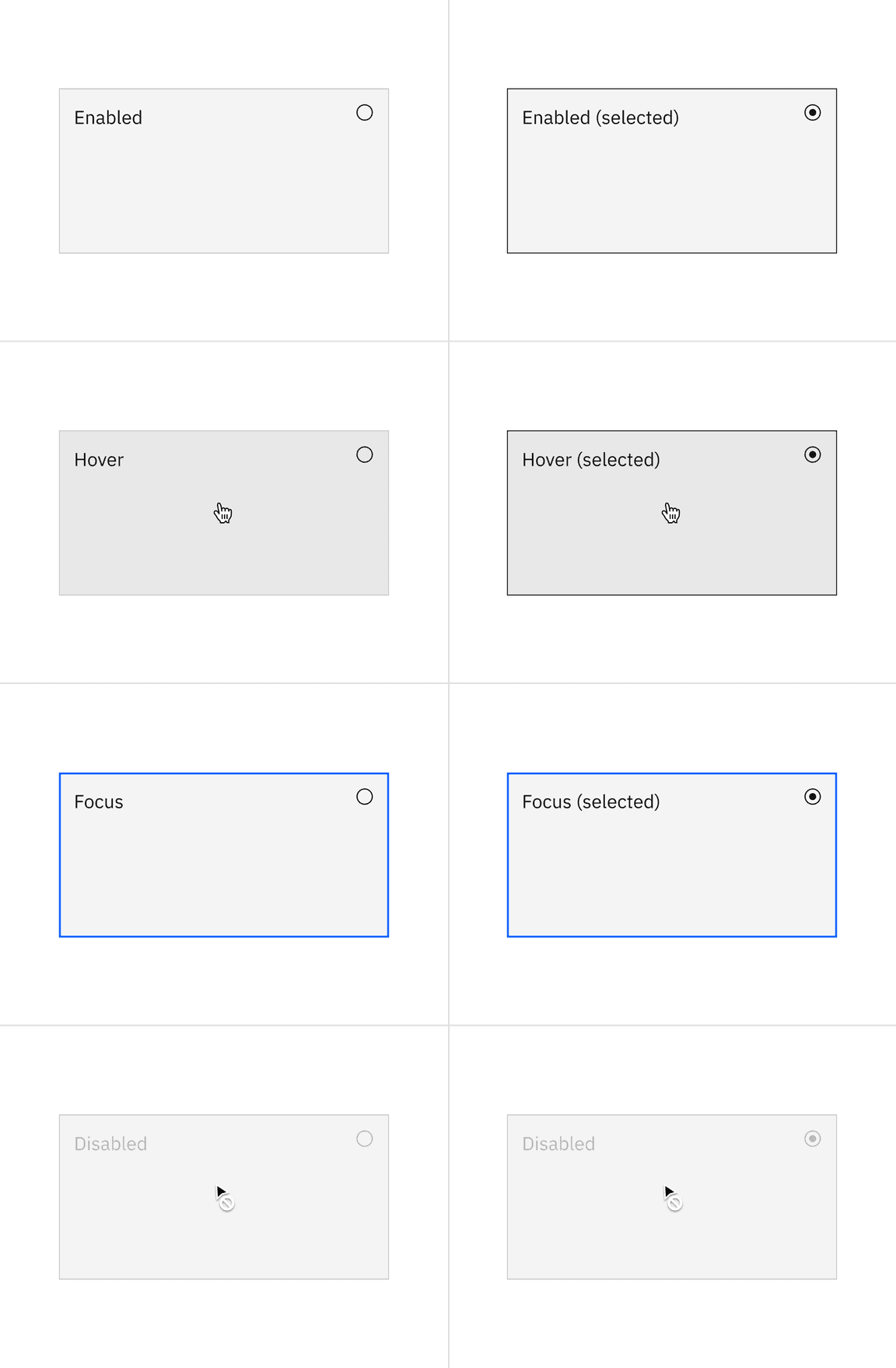
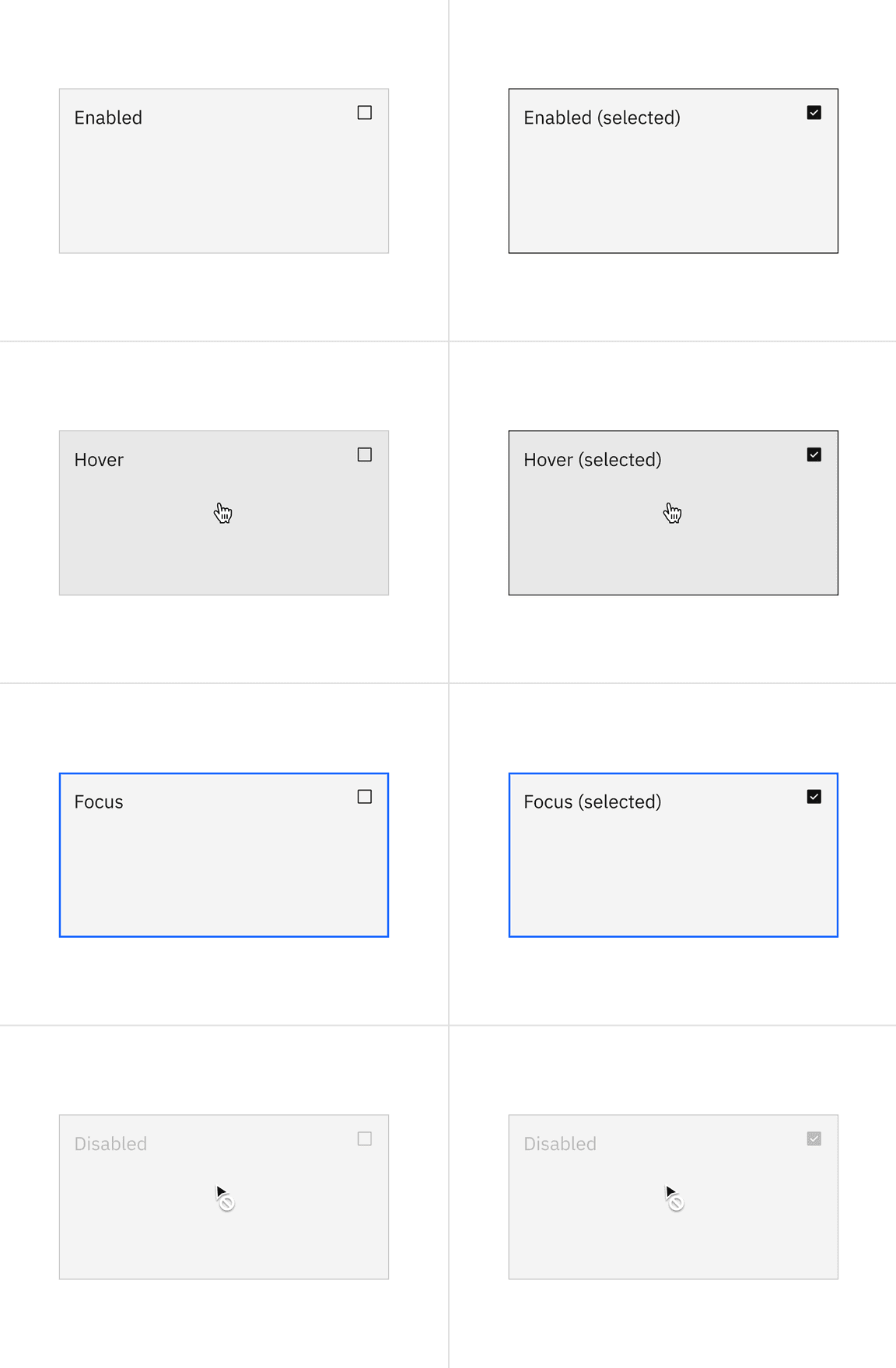
Selectable tiles have five states: enabled, hover, focus, selected, and disabled.
Expandable tiles
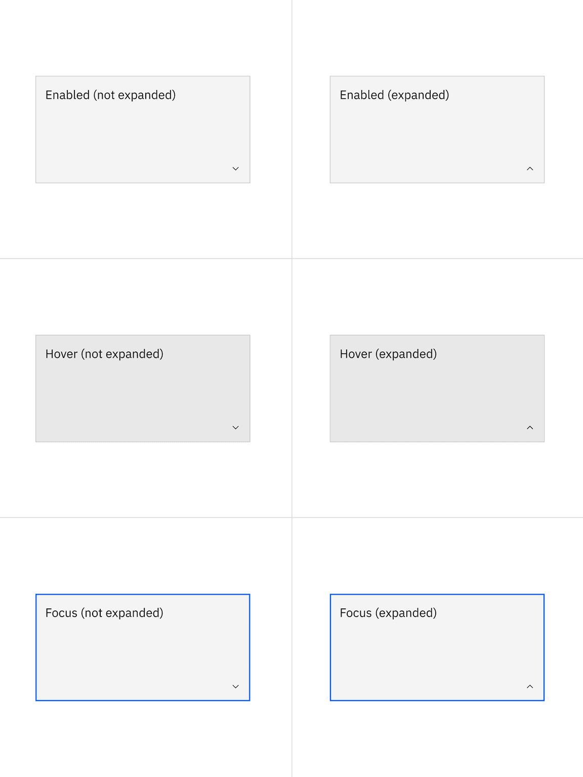
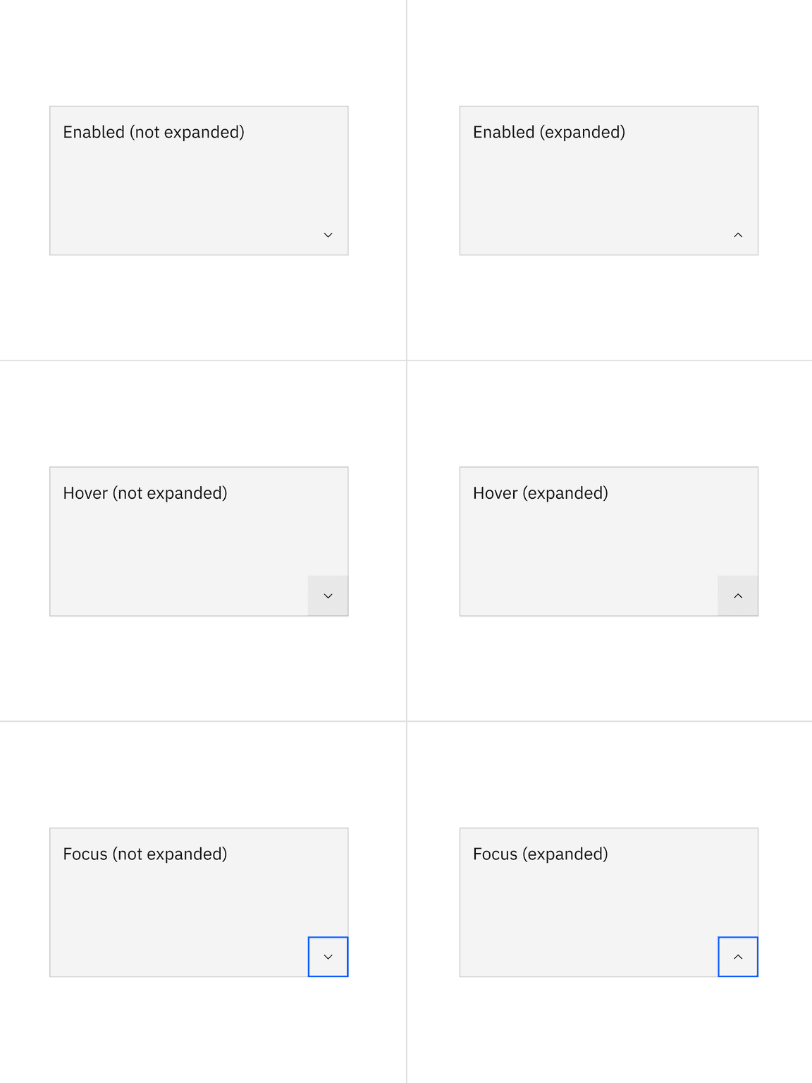
Expandable tiles have three states: enabled, hover, and focus.
Typography
The default token for the title is
$body-compact-01
| Element | Font-size (px/rem) | Font-weight | Type token |
|---|---|---|---|
| Tile | 14 / 0.875 | Regular / 400 |
|
| Description | 14 / 0.875 | Regular / 400 |
|
Structure
| Element | Property | px / rem | Spacing token |
|---|---|---|---|
| Tile | min-height | 64 / 4 | – |
| min-width | 128 / 8 | – | |
| padding (minimum) | 16 / 1 |
|
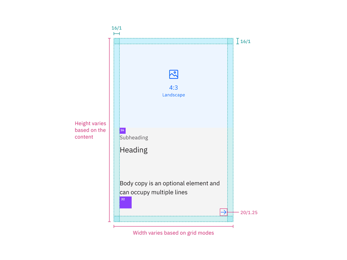
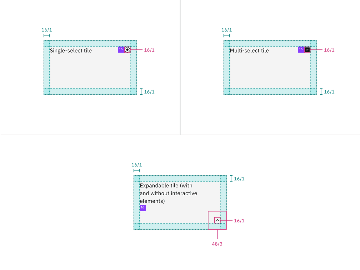
Structure and spacing measurements for tile | px / rem
Proportions for grid
| Percentage | XL 1600-1200 | L 1200-992 | M 992-768 | S 768-576 | XS 576-0 |
|---|---|---|---|---|---|
| 100% | |||||
| 1/2 | |||||
| 2/3 | |||||
| 1/3 | |||||
| 1/4 | |||||
| 1/6 |
AI presence
The following are the unique styles applied to the components when the AI slug is present. Unless specified, all other tokens in the components remain the same as the non-AI variants.
More information about designing for AI guidelines is coming soon.
| Element | Property | Token / Size |
|---|---|---|
| Tile:background | background-color |
|
| box-shadow |
| |
| inner-shadow |
| |
| Linear-gradient:background | start |
|
| top |
| |
| Linear-gradient:border | start |
|
| stop |
| |
| AI slug | size | mini |
- Denotes a contextual color token that will change values based on the layer it is placed on.
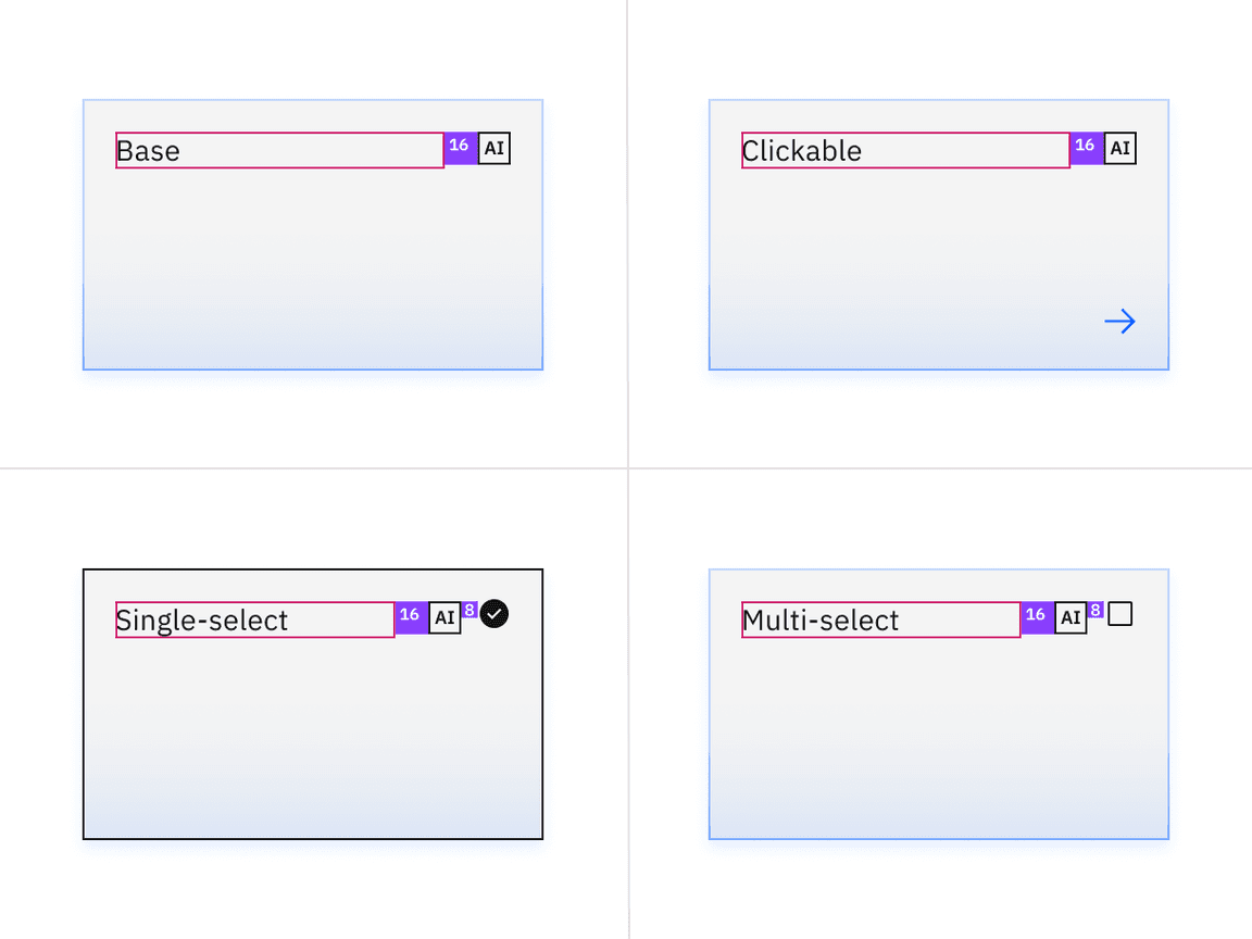
Structure and spacing measurements for tile with AI presence
Feedback
Help us improve this component by providing feedback, asking questions, and leaving any other comments on GitHub.